Tuesday 15 March 2011

Final Design & Thoughts


So this is my final piece and i'm quite pleased with the outcome.  After messing around endlessly i now feel that the text balances out with the curviness of the paper form so everything flows nicely round the page and you eye are guided from the title to the writing at the bottom by the curvature of the droplet.

My decision to use silhouette letters has paid the price a bit, they are a bit uneven and the 100 is out of focus and quite blurry although still readable. But i just didn't want to pick a font from photoshop and whack it on the poster, anyone can do that. I wanted to try something different and although it hasn't fully paid off, i think it still produces a very nice effect, it subtle, not in your face. It has a calm affect I think. The colours in the design are of a warm nature trying to create a pleasurable viewing experience for the viewer

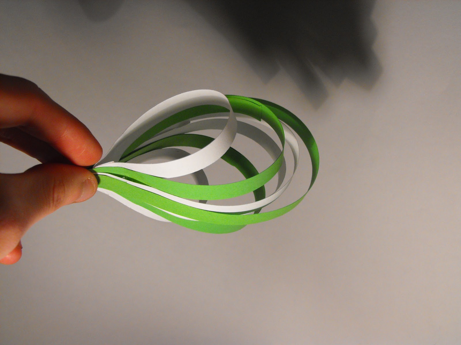
With the paper sculpture i had fun developing the shape over the past couple of weeks. Its good to start with an idea and just keep progressing with it until you come out with a final outcome, its quite satisfying. The shape itself it nothing special really, its all in how its photographed as the angle is a crucial thing. As there were only certain angles where it would produces this teardrop shape. But it was worth it as i think its an interesting take of the teardrop form, each of the strips look like the bare essence of the structure help keeping it up.

Moving on, throughout my sketchbook i made clear that this poster did have a rough concept behind it, and that develop through out the project through doing research. For me now, this shape represents the start of something, the first drop of ink on a new design. Or in a more general sense a start of something new for the company or a sign that theres still lots more to come from them despite their age. You can read into it as much or a little as you want its just there to be interpreted.

Overall i have enjoyed this project, it was a challenge at first, getting to grips with the paper but in the end i have learnt a great deal which will be most certainly valuable in the future  

Layout Development

I added the text to the image and this shows a series of tweaks i made to the design, especially the text, just experimenting with compositions seeing which work and which don't ( full development with notes can be found in my sketchbook).


On photoshop i used the rubber tool on a low opacity to get ride of the colour around the text and neaten it off.

Final elements seperate


These are the images am i going to be using for my final design


Finding The Right Picture

So i've decided that this model will be incorporated into my final design as i feel its my best model and has shown a good development throughout to get to this stage.


I now need to take into careful consideration about composition and lighting to get the look just right


These photos suffer from to much into lighting. I think i didn't have my camera set right, i need to adjust it to counteract the yellowness of the lighting.

So i've fixed the yellow tinge problem now, yays, however the images just aren't springing off the page, i need to get some side lighting to create contrast and add depth bringing the image to life.


These images came out really well, i turned on a bedside light, which casted a shadow on one side of the model. It definitely gives it more atmospherical tone it 

theres always a plan B aha

i used the offcuts from the other stencils to create this type. Its been made from all the different fonts and sizes when i tested them so each letter is different in size, style etc. 


At least i had something like this incase my stencil idea didn't work out, luckily it did :)

My stencils

So i did a test on some different fonts to see which one would work best when cast as a shadow, these are the results
just showing how the stencil and shadow of the letter was created

from the top the fonts are Gill Sans, New Gothic and Universe

after these test i had decided that i wanted to use New Gothic.....

However....

i remember the website to GFSmtih


I cant believe i didn't think if this straight away, but anyway i did a bit a research and i found that the font used id Helvetica

I felt i should choose Helvetica over New Gothic because i wanted something authentic to the company and its a font they've used throughout their website.


So i will now recreate the stencil but now in the Helvetica font


So here is the stencil and font i will be using for part of my poster design.

shadow puppets

different opacities with have different effects with the light as some light cud get through some light materials.


Also knowing about how moving the object closer and further away from the light source will change the size of the shadow cast.

Accidentally found a solution!

So whilst moving a paper model from my desk it moved past the light and i realised it had cast a shadow on the wall... *lightbulb* it give me the idea that i could do the exact same thing with type, cut it out and hold the stencil up to the light and it will cast a shadow leaving only the exposed letter shape in a lighter tone.

Stencils

So because i wanted my type to be of a hollow nature i thought the best thing to start looking at is stencils.


This is a great idea, the fact that the type i hollow but has been filled in with another texture is exactly the type of thing i was looking for


the one thing i love about stencils is their individuality, like the way some of the spray is surround the letter, no rough stencil like this will ever be exactly the same. I like that sense of one off's, makes the ext special and more personal 

Type and my Concept


showing what i want my text to be like because of the concept i have about the design

Sticking With Simplicity

Even though these design may not be as striking as the ink inspired one, i feel having one tonal colour is enough for the design. It gives you something that will attract you with the colour adn then your intrigued by the actual form of the shape.


im thinking of the idea of having the colour correspond to a certain aspect of the company like green could represent everything thats recyclable within the company etc

Ink Cartridge References

This idea came about as i realised as i changed the ink cartridge on my printer. I noticed the 4 main colours black, cyan, magenta and yellow, i had a mini brain wave and thought it might be a interesting idea to create one of these 3D Droplets using the colours of ink printers.


Even though i do like the concept and the colours are vivid and eye catching, i just don't think it work for my idea. The colour are all trying to catch your eye's attention that you loose focus on what the model is meant to be of, it gets lost under all the bright colour. This is why i am not going to pursue this design.